 |
| Quotasoon Font |
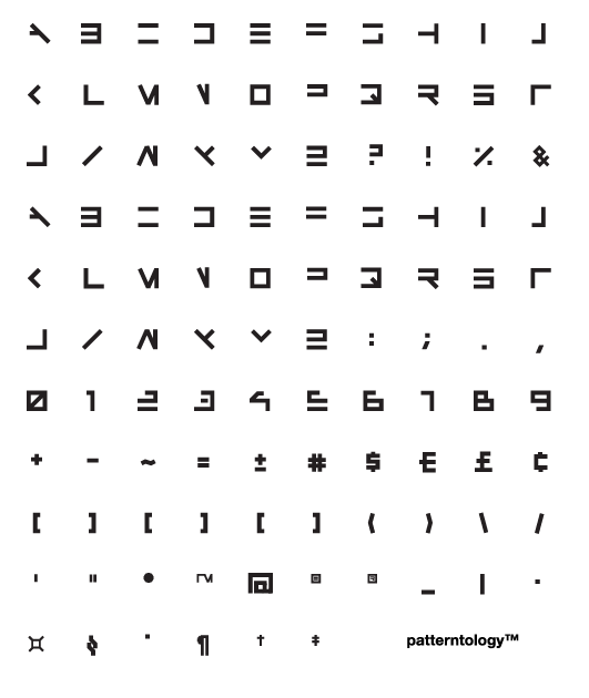
I love basic design problems like this. The general rule for me was to eliminate the left vertical element of every character if possible and also base each letter within a square. As I made my way to the numbers and special characters, my rules became more and more broken but I felt some better recognition was needed if I were to use the full keyboard when writing something.
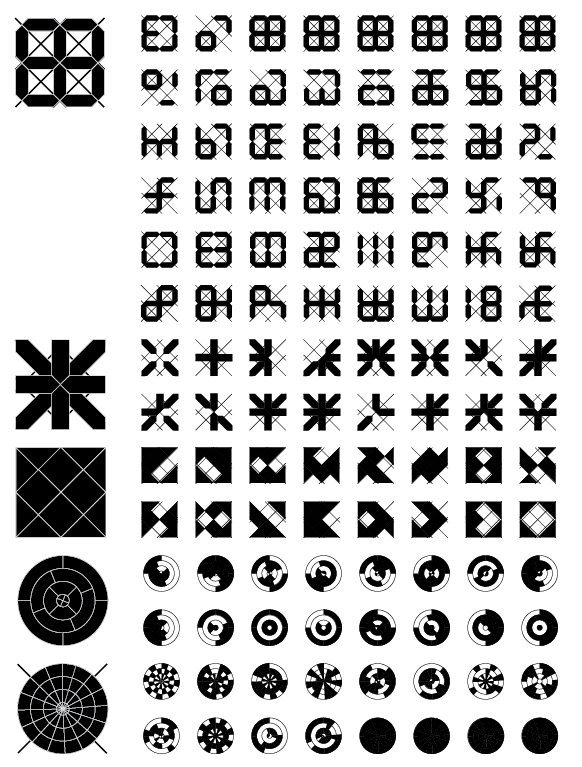
This whole opportunity was timely as I'd been playing with mysterious typeface inspired by Timothy Ely and his cribriform. Every time I start on a new project I get into the nitty gritty with the vector artwork. I just love making tile systems and fleshing them out. My goal is to flesh out square, triangular and circular based symbols. This roughly coincides with an elemental concept of earth, air and water that will evolve as a theme. My concept of fire is morphing into transformative energy ideas more on par with my visualization of quantum mechanics. More on that in the future...